Create a scatter plot#
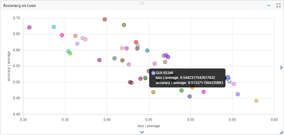
If you have two metrics or parameters that you wish to compare or see how they relate to each other throughout the runs, you can create a scatter plot.
The scatterplot widget supports the following field types: Float, Int, and Datetime, in any combination.
To create a scatter plot:
- In the Compare runs view, click the eye icon () next to each run to include or exclude it from the comparison.
- Create a new custom dashboard or edit an existing one.
- In the top-right corner, click Add widget.
- Choose the Scatter plot widget type and enter a title for it.
- Click Add field and select a metadata field for each axis.
- Click Save widget.
- Save your dashboard.
You can edit the scatterplot widget by going to its settings () and clicking Edit.